Monday, May 18, 2015

Lab 4 Mini - Final Project

Introduction

For Lab 4 we were to come up with a simple question and answer it effectively using spatial tools.

My question was this, "Where can the Wisconsin DNR expand its forest fire management area near cities?"

This question entered my brain as I looked over data the DNR has available online. I noticed there was a fire amount of wildfires that occurred outside of the coverage area many of which were near cities. I decided to base my project around fire data in a 10 year period from 1998-2008.

Data Sources

To solve the question I posed I needed a variety of data including fire data, city locations, DNR protection area, county forest, national forest and WI state outline. This data could be found provided by the Wisconsin DNR and ESRI. The data can be found at this web address ftp://dnrftp01.wi.gov/geodata. Even though the data came from the DNR I had a few concerns mostly related to age of data. I was hoping for more up-to-date fire occurrence as the most recent data is from 2008 so I'm missing seven years worth of data. I also am concerned with the DNR protection area data as I could not find the age of the data, their protection area could be very different today if that data is 10 years old.

Methods

To solve my proposed question I used a variety of tools in ArcGIS including, unions, erase, buffer, intersect and clip. I first started by using the union tool on both county and national forest class to give me one Forest Land class. After, I used union again with Forest Land and Intensive and Extensive Protected Fire Area to give me my total protected area class (Figure 1). I made a feature class containing only fire occurrences from 1998-2008 (Figure 2) and used the erase tool on that class along with my protected area class to give me the locations of fire outside of the protection area. I buffered this class and found out which fires had occurred within 10 miles of a Wisconsin city. I intersected my cities with fires and was left with my areas in need of additional protection outside of the DNR's coverage area. For aesthetics I clipped this class so that the buffers stayed within the States outline. The entire process can be found in the model below (Figure 3).
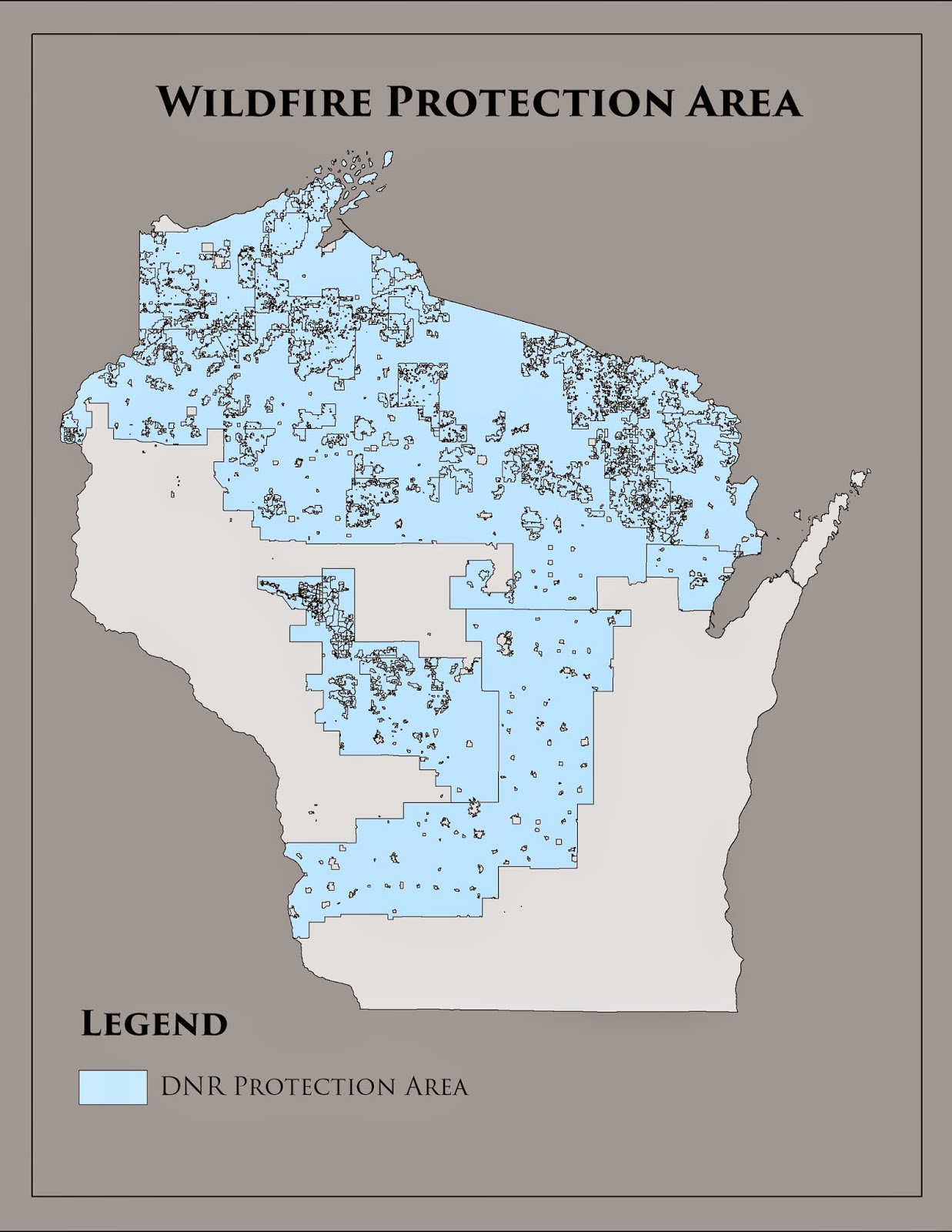
Figure 1
Figure 2


Figure 3
Results
 
The results from the above steps can be seen below. The map (Figure 4) includes the proposed protection areas outside of the current DNR coverage in relation to the cities of Wisconsin. The proposed areas are within 10 miles of a Wisconsin city and were areas that had experienced issues with wildfires from 1998-2008. This map could be used if the DNR was looking to expand their coverage area and this would give them some justification to do so as there is huge amounts of property to protect near cities and many potential lives at stake.  
Figure 4
Evaluation
 
I'm happy with the result of this project. It allowed me to truly test what I've learned throughout the semester and accomplish something without really following step by step instructions. If I was to do the project over again I might factor some other variables in such as population of county in relation to the number of fires or something a long those lines. As far as challenges go I really only struggled at the end of the process figuring out how to only buffer near the cities which had wildfires in their proximity and not just every city in general but that was an easy problem to fix with a couple of tries.


Friday, May 8, 2015

Lab 3: Vector Analysis with ArcGIS

Goal:
The primary goal of this lab was to use a variety of geoprocessing tools we have learned within ArcGIS to find the best bear habitat for a study area found in Marquette county, Michigan.

Background:
Using recorded GPS data and tools in ArcGIS, the DNR of Michigan wanted to know what the best suitable habitat was for black bears following a couple of specific criteria.

Methods:
Included in the data was an excel file that had the bear locations. In order for it to be used I had to import it into ArcGIS. Once the data was imported and exported as a feature class I could add it to my geodatabase. Once adding the bear locations to my study area map I was able to see where the bears were located.

In order to find the top habitats based on the bear locations I had to join them with the land cover type class. After analyzing and summarizing the data I was able to find the top three land covers. They included mixed forest land, forested wetlands, and evergreen forest land. I created a separate feature class just including these three.

The next step was seeing how many bears were found near to streams. I put a 500 meter buffer around the streams in the study area. Along with adding the buffer it was also dissolved for clarity reasons. Once those two processes were finished the result was clipped with the bear locations. Over 70% of bears located were within 500 meters of a stream. This made sense as streams can be used as a major source of nourishment.

The next step was to find the best habitat within the 500m buffer. To do so I intersected the feature class that included the three land covers and the buffered stream. This resulted in a potential habitat feature class. I dissolved this class like the other for clarity and continuity purposes.

One of the last factors I had to account for was DNR owned land that fell into the potential bear habitat. I clipped the DNR feature class with the study area. This got rid of any impertinent data. Once again I dissolved the internal boundaries and intersected this feature with the potential habitat. This resulted in creating a feature class showcasing potential bear habitat on DNR land.

The last factor I had to consider was proximity to Urban or Built-Up lands. I ran the buffer tool on a feature class I created that just had that Major type of land cover. I then erased the result but left it on the map in a different color showing habitat that met all criteria except being outside of 5km on urban area.

The steps I used can be found in the model labeled Figure 1. Figure 2. consists of Python code that was used to make a stream buffer, intersect it with land cover and then erase the urban area near. Figure 3. shows the results of the lab.
Figure 1.

Figure 2.
Figure 3.
Results:
The map above highlights habitat areas for black bears in the study area. The DNR land is primarily in the middle of the study area. The suitable habitat near urban areas is found in the southern half specifically south west. There is a lot of suitable habitat found the northern half away especially in the northwest part away from urban areas so if the DNR was looking to expand it's coverage; there would be many suitable options.

Data Sources:
 
Land cover - USGS NLCD
http://www.mcgi.state.mi.us/mgdl/nlcd/metadata/nlcdshp.html

DNR management units http://www.dnr.state.mi.us/spatialdatalibrary/metadata/wildlife_mgmt_units.htm

Streams
http://www.mcgi.state.mi.us/mgdl/framework/metadata/Marquette.html


Friday, March 20, 2015

Lab 2 - Wisconsin Population and Median Age by County

Background Information:

The purpose of this lab was to become familiar with bringing in various data sets, checking their data integrity and then using these data sets to make them visually pleasing. We focused on using the United States Census Bureau for getting our data. Being that it was the Census Bureau we were not too concerned with the quality and source of the data. We were to create a map with Wisconsin's population by county and also a map presenting a data set of our own choice.

Methods:

The first step was getting comfortable using the U.S Census Bureau's website. By following this hyperlink you are brought to the Fact Finder Census Bureau Website. To acquire the population information for Wisconsin select "people" on the left hand side of the page and from there "basic count/estimate." From there scroll until you find the desired information, in this case it was total population and download it.

To acquire the Wisconsin shape file, go to "geography" on the left hand side of the page. To get all the counties click "state" then "counties" and select "all counties" for the state of Wisconsin.

Once downloading the desired files you have to unzip the newly acquired attribute tables. View the tabular and metadata in Excel and be sure the change the CSV file in to an MS Excel Workbook file. This allows the data to be used in ArcGIS.

From there I added the shape file to ArcGIS and also my unzipped MS Excel Workbook file. It is important to check the attribute table and verify all the data carried over and is not corrupt or missing.

To join the shape file and Excel table there has to be a common attribute to link them together. In this case, they both shared a GEO#id so the tables were linked together through that.

Now that my data was linked, I simply had to change the symbology under properties and change it to graduated colors so differences in data could be easily recognized and visually appealing. There was no need to normalize this data set.

To create the second map I essentially followed the exact same steps except with a different variable this time. The first map focused on a total population dataset while for my second map I chose median age. Fortunately the common attribute between by shape file and data set was GEO#id so that step remained the same. My second data set had three variables so by using the meta data I was able to pick which variable I wanted to present. I chose median age for both males and females in the state of Wisconsin.

Because I was focusing specifically on Wisconsin, I changed the projection for both data frames to NAD 1983 Wisconsin TM.

 
Results:
Figure 2.1 The map on the left presents the population of each county while the right map shows the median age by county.
 The graphic above shows two different maps made of Wisconsin. By looking at the map you can see that population and median age are directly related. In more populated counties there tends to be a trend of a lower median age.

Sources: United States Census Bureau. (2015, March 20).


Friday, February 20, 2015

GIS I Lab 1: Base Data - Confluence Project

Background Information:
The Confluence Project is a multi-organization project located right at Eau Claire's confluence. The project is supported partially by Eau Claire county, the state, and outside donators. The project includes housing, a community center, and a venue for a variety of different performances.
Methods: 
The first step in the process was making a new geodatabase that would hold the information pertaining to the proposed Confluence Project site. This involved digitizing the proposed site in to a feature class. With the site being digitized it was much easier simply adding it from the geodatabase for each individual map rather than digitizing it for six maps.

Using the newly created geodatabase along with information provided by the city and county of Eau Claire six maps were made showing various data in reference to the Confluence Project site. These six maps can be found below in (Figure 1.1)

The first map shows the parcel data and proposed site. A basemap was inserted with parcel area, centerlines and any water features near the site layered on top.

The second map features the proposed site with the Public Land Survey System or PLSS feature class added over our basemap. This gives an idea of a more specific location for the proposed site.

The third map focuses on civil division in Eau Claire County. A basemap was used with the digitized proposed site overlaying. This shows the Confluence Project will be located in the city of Eau Claire and also how a snippet of the county is divided in to different civil divisions.

The fourth map focuses on population density and census boundaries around the confluence. Along with the basemap, information from the city and county was used to represent the pop. density in and around where the proposed site is located.

The fifth map breaks a part of the city in to different zoning classes. A zoning area features class was used and sorted in to similar classifications. With the information sorted and classified it made the appearance of the map and information easier to interpret and understand.

The final map deals with the numerous voting wards in Eau Claire. A data frame was inserted along with a basemap, the proposed site and also the voting ward feature class. Labels were added to the wards for easy identification.
(Figure 1.1)

Although the maps really do not present any patterns between one another they do give us some insight on the area around the proposed site. There is a relatively dense amount of people already living near the proposed area and with even more housing being brought in that number will only rise higher. It is also interesting that the Confluence Project will be not only residential based but also commercial and public.

Sources:
Q:\StudentCoursework\CHupy\2155.GEOG.335.001\LAB\lab1\City of Eau Claire.gdb
Q:\StudentCoursework\CHupy\2155.GEOG.335.001\LAB\lab1\2009-07-13_EauClaire.gdb
Mapping Services. (n.d.). Retrieved February 20, 2015, from http://www.eauclairewi.gov/departments/public-works/engineering/mapping-services